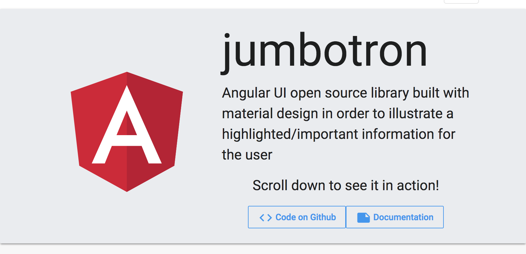
jumbotron - Angular UI open source library built with material design in order to illustrate a highlighted/important information for the user - Angular 6 supported


Built by and for developers :heart:
Do you have any question or suggestion ? Please do not hesitate to contact us! Alternatively, provide a PR | open an appropriate issue here
If you like this project, support angular-material-extensions by starring :star: and sharing it :loudspeaker:
Table of Contents
- Demo
- Dependencies
- Peer Dependencies
- Additional Requirements - material (Include a theme)
- Additional Requirements - material icons
- Installation
- Usage
- Documentation
- Run Demo App Locally
- Development
- Other Angular Libraries
- Support
- License
Demo
View all the directives and components in action at https://angular-material-extensions.github.io/jumbotron
Dependencies
- Angular (requires Angular 2 or higher)
Requirements (peer dependencies):
- angular flex-layout v6.0.0-beta.16
- angular material v6.3.0
- angular cdk v6.3.0
- angular animations v6.0.5
npm i @angular/cdk @angular/material @angular/flex-layout @angular/animations Additional requirements Theme (Material Design)
Additional Requirements - Import the material design icons learn more
- The easiest way to import material design icons is to provide a link in your
index.htmlfile like below:
<link href="https://fonts.googleapis.com/icon?family=Material+Icons" rel="stylesheet">alternative solution:
Install of the official npm module of the material design icons
npm i -s material-design-icons- Import them in your
angular.jsonfile
"styles": [
        "styles.css",
        "../node_modules/material-design-icons/iconfont/material-icons.css"
      ],
Installation
Install above dependencies via npm.
Now install @angular-material-extensions/jumbotron via:
npm install --save @angular-material-extensions/jumbotronSystemJS
Note:If you are using
SystemJS, you should adjust your configuration to point to the UMD bundle. In your systemjs config file,mapneeds to tell the System loader where to look forjumbotron:`js map: { 'jumbotron': 'node_modules/@angular-material-extensions/jumbotron/bundles/jumbotron.umd.js', }
---

Once installed you need to import the main module:
```js
import { MatJumbotronModule } from '@angular-material-extensions/jumbotron';
The only remaining part is to list the imported module in your application module. The exact method will be slightly
different for the root (top-level) module for which you should end up with the code similar to (notice MatJumbotronModule.forRoot()):
import { MatJumbotronModule } from '@angular-material-extensions/jumbotron';

@NgModule({
  declarations: [AppComponent, ...],
  imports: [MatJumbotronModule.forRoot(), ...],
  bootstrap: [AppComponent]
})
export class AppModule {
}
Other modules in your application can simply import MatJumbotronModule:
import { MatJumbotronModule } from '@angular-material-extensions/jumbotron';

@NgModule({
  declarations: [OtherComponent, ...],
  imports: [MatJumbotronModule, ...],
})
export class OtherModule {
}
Usage
mat-jumbotrona material card layout that holds (optional) an image and the content of themat-jumbotron-contentmat-jumbotron-contentis the main content of the jumbotron and can contains anything! It's your template
Example
<mat-jumbotron imgURL="assets/logo.svg">
  <mat-jumbotron-content>
    <h1 class="display-1" ngClass.xs="display-3 text-center" ngClass.sm="display-3">jumbotron</h1>
    <p class="headline" ngClass.xs="text-center">Angular UI open source library built
      with material design in order to illustrate a highlighted/important information for the user
    </p>

    <p class="text-center"> Scroll down to see it in action!</p>

    <div fxLayout="row" fxLayout.xs="column"
         fxLayoutGap.xs="1rem"
         fxLayoutAlign="center center">
      <a mat-stroked-button
         color="primary"
         target="_blank"
         href="https://github.com/angular-material-extensions/jumbotron">
        <mat-icon>code</mat-icon>
        Code on Github
      </a>
      <a mat-stroked-button
         color="primary"
         target="_blank"
         href="doc/index.html">
        <mat-icon>note</mat-icon>
        Documentation
      </a>
    </div>

  </mat-jumbotron-content>
</mat-jumbotron>
the result will be the screen shot displayed above! For a live example, please visit the Demo App
API
mat-jumbotron
| option | bind | type | default | description |
|---|---|---|---|---|
| imageURL | Input() | string | - | the image src url to be displayed in the jumbotron |
Example
Documentation
Please checkout the full documentation here or follow the official tutorial
Run Demo App Locally
clone this repo by running
$ git clone https://github.com/angular-material-extensions/jumbotron.gitlink the @angular-material-extensions/jumbotron package use gulp globally
$ gulp link
use gulp locally
$ npx gulp linkfor some mac os users, you may use the sudo command with gulp use gulp with sudo
$ sudo gulp linkor locally
$ sudo npx gulp linknavigate to the demo app directory
$ cd demoinstall the dependencies
$ npm irun/start/serve the app
$ npm run startor
$ ng serve --open- the app is now hosted by
http://localhost:4200/
Development
- clone this repo
- Install the dependencies by running
npm i - build the library
npm run buildorgulp buildTo generate all*.js,*.d.tsand*.metadata.jsonfiles:
$ npm run buildLink the library
- on windows
gulp linkor locallynpx gulp link on mac/linux
sudo gulp linkor locallysudo npx gulp linkNavigate to the demo app's directory
cd demo_npm i_npm start
- on windows
extras
To lint all *.ts files:
$ npm run lintOther Angular Material Extensions Libraries
- ngx-auth-firebaseui
- @angular-material-extensions/pages
- @angular-material-extensions/password-strength
- @angular-material-extensions/google-maps-autocomplete
- @angular-material-extensions/faq
- @angular-material-extensions/contacts
- @angular-material-extensions/combination-generator
Support
- Drop an email to: Anthony Nahas
- or open an appropriate issue
let us chat on Gitter
Built by and for developers :heart: we will help you :punch:
License
Copyright (c) 2018 Anthony Nahas. Licensed under the MIT License (MIT)