@angular-material-extensions/fab-menu - Angular Material component that allow users to select a country or nationality with an autocomplete feature - Angular V10 supported incl. schematics


Built by and for developers :heart:
Do you have any question or suggestion ? Please do not hesitate to contact us! Alternatively, provide a PR | open an appropriate issue here
If you like this project, support angular-material-extensions by starring :star: and sharing it :loudspeaker:
Table of Contents
- Demo
- Components
- Dependencies
- Installation
- API
- Usage
- Run Demo App Locally
- Other Angular Libraries
- Support
- License
Demo
View all the directives and components in action at https://angular-material-extensions.github.io/fab-menu
Library's components
<mat-fab-menu>used to display the main component
Dependencies
- Angular developed and tested with
8.x
Installation
1. Install via ng add. (Recommended)
If Angular Material Design is not setup, just run ng add @angular/material learn more
Now add the library via the angular schematics
ng add @angular-material-extensions/fab-menu2. Install via npm. (Alternative)
Now install @angular-material-extensions/fab-menu via:
npm install --save @angular-material-extensions/fab-menuImport the library
If you installed the library via angular schematics, you can skip this step
Once installed you need to import the main module:
import { MatFabMenuModule } from '@angular-material-extensions/fab-menu';import { MatFabMenuModule } from '@angular-material-extensions/fab-menu';
@NgModule({
declarations: [AppComponent, ...],
imports: [MatFabMenuModule, ...],
bootstrap: [AppComponent]
})
export class AppModule {
}Other modules in your application like for lazy loading import MatSelectCountryModule into your feature module:
API
<mat-fab-menu> used to display the main component - see the demo examples
| option | bind | type | default | description |
|---|---|---|---|---|
| fabButtons | Input() |
MatFabMenu[] |
- | array of floating actions button as menu to render |
| icon | Input() |
string |
add |
material icon string e.g: home, mail, phone see more |
| direction | Input() |
MatFabMenuDirection |
top |
the direction of buttons: `'top' |
| color | Input() |
ThemePalette |
accent |
the color of the main fab: primary, accent or warn |
| isActive | Input() |
boolean |
falase |
Whether the component is active |
| disabled | Input() |
boolean |
false |
Whether the component is disabled |
| closeAfterSelection | Input() |
boolean |
true |
Close after selecting a fab menu item |
| onFabMenuItemSelected | Output() |
EventEmitter<string | number> |
- | emits the selected button by id |
Methods
@ViewChild('matFabMenu', { static: false }) matFabMenu: MatFabMenu;toggle() will toggle the isActive property
Important interfaces or type
import {ThemePalette, TooltipPosition} from '@angular/material';

interface MatFabMenu {
  id: string | number;
  icon?: string; // please use either icon or imgUrl
  iconColor?: ThemePalette;
  imgUrl?: string; // please use either icon or imgUrl
  tooltip?: string;
  tooltipPosition?: TooltipPosition;
  color?: ThemePalette;
}

type MatFabMenuDirection = 'top' | 'bottom' | 'left' | 'right';
Usage
<mat-fab-menu color="primary"
              [fabButtons]="fabButtonsRandom">
</mat-fab-menu>
import {MatFabMenu} from '@angular-material-extensions/fab-menu';
fabButtonsRandom: MatFabMenu[] = [
{
id: 1,
icon: 'create'
},
{
id: 2,
icon: 'mail'
},
{
id: 3,
icon: 'file_copy'
},
{
id: 4,
icon: 'phone'
},
];try to use your own svg instead of material icons:
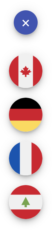
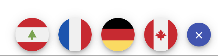
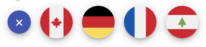
import {MatFabMenu} from '@angular-material-extensions/fab-menu';

fabCountries: MatFabMenu[] = [
    {
      id: 1,
      imgUrl: 'assets/countrys-flags/svg/canada.svg'
    },
    {
      id: 2,
      imgUrl: 'assets/countrys-flags/svg/germany.svg'
    },
    {
      id: 3,
      imgUrl: 'assets/countrys-flags/svg/france.svg'
    },
    {
      id: 4,
      imgUrl: 'assets/countrys-flags/svg/lebanon.svg'
    },
  ];
<mat-fab-menu color="primary"
[fabButtons]="fabButtonsRandom">
</mat-fab-menu>
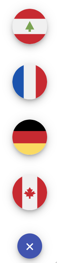
<mat-fab-menu color="primary"
              direction="bottom"
              [fabButtons]="fabButtonsRandom">
</mat-fab-menu>
<mat-fab-menu color="primary"
              direction="left"
              [fabButtons]="fabButtonsRandom">
</mat-fab-menu>
<mat-fab-menu color="primary"
              direction="right"
              [fabButtons]="fabButtonsRandom">
</mat-fab-menu>
Run Demo App Locally
Build the library
after installing the dependencies with npm i
$ npm run build:libServe the demo app
$ npm startOther Angular Libraries
- ngx-auth-firebaseui
- ngx-linkifyjs
- @angular-material-extensions/password-strength
- @angular-material-extensions/google-maps-autocomplete
- @angular-material-extensions/link-preview
- @angular-material-extensions/select-country
- @angular-material-extensions/pages
- @angular-material-extensions/select-country
- @angular-material-extensions/contacts
Support
Drop an email to: Anthony Nahas
or open an appropriate issue
let us chat on Gitter
Built by and for developers :heart: we will help you :punch:

This project is supported by jetbrains with 1 ALL PRODUCTS PACK OS LICENSE incl. webstorm
License
Copyright (c) 2019-2020 Anthony Nahas. Licensed under the MIT License (MIT)